The world of the web designing, web development and other web design tutorials.

Slider (DO NOT EDIT HERE!)

Tuesday, 22 July 2014

Web Development Tools For Different Browser

development tools

Many development tools are available in the market  but it is very difficult to select best one of these. The web development tools help us to write proper code for our website. They debug the errors and inspect the our HTML, CSS, Document Object Model (DOM) JavaScript. The different browser have different development tool such as firebox have firebug which is the most development tools now a days. Today i am going to explain about these development tools.

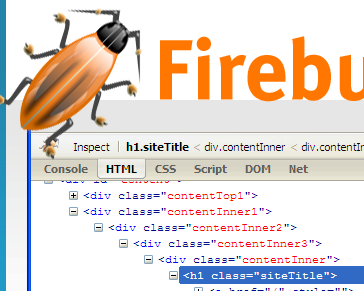
Firebug For Firefox

The firebug is  the famous development tool for the Firefox. Firebug inspect your HTML, CSS and JavaScript. Fire bug is best tool for debugging JavaScript and it is also help in using document object model (DOM).it will tell you about and which on which line and you can manage your layout.Firebug Add-ons
development tools

Dev Tool For Google Chrome

The dev tool is the another best development tool for Google chrome. it is also allow you to inspect HTML, CSS and JavaScript. it visualize the css and html. You can find errors in JavaScript easily with it. You don't need to add it to the Google chrome. It is already the part of it.
You can active it with clicking right mouse button and select inspect element.
If you want to learn more about dev tool of chrome click here for tutorials.
development tools

Dragonfly For Opera

The dragonfly is the high quality development and debugging tools for opera. Dragonfly is html5 based application it is very powerful development tools. Like opera you don't need to add it in opera. You can active by keyboard shortcut hold cntrl+shift and then press I and another way click the right button and select inspect element. Opera Dragonfly
development tools

Conclusion
Now you friends try these tool which one you like most and use it. One more thing if any body want to learn the JavaScript then these tools are very helpful for those. Remember in your prayers and don't forget to share our post with your friends.
Read More...

Saturday, 19 July 2014

How to Create Fixed Layout With CSS


Most important problem which is faced by every new designer is to make or create layout. To create more professional good looking layout you need lots of hard work and practice. For creating layout you must know which type of layout you are creating. it is fixed fluid or responsive which one is this? If you are creating fixed layout you must have understanding of fixed layout. Our layout contain on few things thinking designing and coding. Before making layout you must have knowledge of advantages and disadvantages and the screen resolution of layout. Today I am going to explain these things.

Fixed Width Layout

To create fixed width layout we set particular width to our website. As we set 960px for the screen resolution for 1024*768 and our websites looks better on this screen resolution. We set 760px for the screen resolution of 800*600 the website with 760px looks great on 800*600 resolutions. But now days web designer select 1024*768 resolution and higher.

Advantage of Fixed Layout

  1. First advantage  of fixed layout is this type of layout is easy  to use and you customize it easily.
  2. You don’t need min-width and max-width which are not supported by all browsers


Disadvantages of fixed layout

  1. The devices with smaller screen resolution require horizontal scroll bar according to fixed width of layout.
  2. The small width layout (760px) may not look great on large screen resolution.


Center layout
In fixed layout you need to center the your main wrapper to set the margin:0 auto; on other condition your whole layout move to one corner and it not look great.

Creating fixed layout

Thinking and sketching.
First and important part for creating professional layout to thinking. Think out of box try to think some thing different from other don’t copy the styles of other but  get ideas from others design. After thinking sketch the your design on the paper

Designing
After thinking and sketching your design give it color and design on softwares such as Photoshop and illustrator. It is main part in which you design your ideas and your thinking and give it new shape.

fixed layout

Coding
Now it time to code the design the most difficult part is to design and thinking creative design but if you have good knowledge of language such as html, css, and javascript you can easily code your design without facing any difficulty.

Conclusion
Now friend i think you can design a layout and you have all information which you need to create a fixed layout. Inshallah in the future we will discuss other types of layout. But remember one thing which i forgot to mention above is that first time when you create you make lots of mistake but don't get disappoint try again and again  you will be succeed. Remember in your prayers and don't forget to share post with your friends.
Read More...

Tuesday, 8 July 2014

Best Guide Of CSS Tables

css tables

Html tables are headache people don't like tables mostly newbie. Styling tables is not difficult as people think but the table need more concentration. Today we going to explore how to style tables with css? Tables are used for tabular data. Today we only discuss basic styling of html table. To learn css tables you must know about the html tables.If you have good knowledge of html and css you don't need to worry.

CSS Tables With Border Property

For adding the border you use border property.
Example;
table, td, th {
border:1px solid green;
}
css tables

CSS Tables With Collapsed Property

 We used collapse property to collapse the border of table and table cell.
Example;

table{
  border-collapse:collapse;
}
css tables

CSS Tables Width And Height Property

you can add the width and height  to the table it is important for styling css tables because with these properties you look more beautiful.
Example;

table{
width:100%;
}
td,th{
height: 60px;
}
css tables

CSS Tables With Padding Property;


You know that the padding property you control space between the element and border. In tables you can use this property to control the table cell.
Example; 
td,{
padding: 20px; }
css tables

CSS Tables With Text Alignment Property


I think you already know why we use this property but i repeat it again. We use the alignment property to move a text right, center and left.
Example;
table {
width:100%;
}
table,td,th{
border: 1px solid black;
}
td {
padding:20px;
    text-align: center;}
css tables

Conclusion:
Now friend you can style simple tables easily. In the future we will design some tables practically.
Please don't forget to share our post with you friends. THANKS FOR READING
Read More...

Tuesday, 1 July 2014

CSS Margin, Padding And Border Properties

Hi Friends
Today i am going to talk about the margin, padding and border. Where these properties used?, how to calculate margin and padding and why we use these properties. Margins and padding are essential for every web designer to understand it well. When you will style something with css there you will meet with these property so to now these property very clearly is important.Without knowing these properties well you can not code the layout properly.

Box Model:

Box model is used for understanding the concept of layout and using the margin, padding and border properties. Consider a box in which you add margin, padding and border how it looks like.
css box model

Margin:

The margin cover the outside area of an element. It has not background color it is transparent.
Margins can be change individually. If you want to change only one side margin you can use these properties. (margin-top, margin right, margin-bottom, margin-left).

Shorthand Margin :

You can you shorthand method to add the margin for all side at once.
Example 1:
margin: 20px;
for all four sides.
Example 2:
margin: 25px 15px 20 px 10px;
The first 25px is for the top margin, the second 15px is for the right margin, the third 20px is for bottom margin and the forth 10px is for the left margin.
Example 3:
margin: 20px 10px 5px;
The first 20px is for top-margin, the second 10px is for right and left margin and the last 5px is for bottom.
Example 4:
margin: 10px 5px;
The first 10px is for top and bottom margin and second 5px is for the right and left margin.

CSS Border:

With css  border property you can set up the border around an element. The border lie between the margin and padding of an element. You can set the width, border style and border color for the border by these properties(.border-width, border-style and border-color). You can set the border of all side individually (border-top, border-right, border-bottom, border-left).

Shorthand Border:

Yes you can use the short hand method for border.like this;
border: 3px solid blue;
In the above shorthand property 3px defines the width of border, solid defines the border-style and the final blue which defines the border color.

Padding:

Padding cover the space between the border and element or content. Padding is affected by background color. Padding can be changed individually if you want set the padding of one side you use these properties(padding-top, padding-right, padding-bottom, padding-left)

Shorthand Padding:

You can you shorthand method to add the Padding for all side at once.
Example 1:
padding: 20px;
for all four sides.
Example 2:
padding: 25px 15px 20 px 10px;
The first 25px is for the top padding, the second 15px is for the right padding, the third 20px is for bottom padding and the forth 10px is for the left padding.
Example 3:
padding: 20px 10px 5px;
The first 20px is for top-padding, the second 10px is for right and left padding and the last 5px is for bottom.
Example 4:
padding: 10px 5px;
The first 10px is for top and bottom padding and second 5px is for the right and left padding.

How To Calculate The Margin And Padding:

For width:

Consider box with the width of 360px , left-margin=10px and right-margin=10px and the left-padding=10px and right-padding=10px .

Formula for calculating width:

width of box + left-margin + right-margin + left-padding + right-padding = Total width of box

For Height:

Again consider box with the height of 200px , top-margin=10px and bottom-margin=10px and the top-padding=10px and bottom-padding=10px .

Formula for calculating Height:

height of box + top-margin + bottom-margin + top-padding + bottom-padding = Total height of box

Final words:
Now you have complete understanding of box model, margin, padding and border and how to use them.
keep practicing and don't forget to share our post with your friends.
Thanks For Reading
Read More...

Monday, 30 June 2014

How To Write Semantic HTML

semantic html

Hi Friends
Today we are going to discuss about semantic html writting a semantic html is very useful for the webpage and website. the semantic html means to give the meanig to the content and using right tags in the webpage such as paragraph tag some people use paragraph tags use for creating space between text. it will not give meaning to your content html paragraph should be used only for paragraph another example for it the using of bold tag it is not semantic but we use strong tag instead of bold tag.
Also read this :
Text formatting in html.
Html Basi tags.
Top 5 css and html editor.

What is semantic html?

semantic markup or semantic html means to give the meaning to  you content to make your content meaningful.such as image, metadata tag has own content but the div and span have not content meaningful.

Usage Of Semantic Tags.

In semantic html we have give the meaning to our content by using right tags or elements. Such as many new webdesigner made mistakes during structuring the html.

Blockquote: bloackquote is html tag which is used to add quotations in the webpages but the people use it for indent text. Use it for quotation. For indent the text you can use css margins and indent-property(indent-text).

Ul: ul is the html tag for unordered list but the same people also use it for adding the indent to the text.

p: paragraph tag is used to define a paragraph but mostly people use it for creating space between text it is the wrong the method paragraph tag should be used for adding the paragraph.

h1 to h6: heading tags defines the heading. the heading tags should be only used for headlines or heading not for making text bold and bigger. For making text bold and bigger you should use the css font-size property and font-weight property.

Benefits of Using Semantic markup.

  1. It is help to improve seo.
  2. Easy to use.

List of Semantic tags:
For list of semantic tags click here:

Final words:
Now you can write the semantic html. Please friends share my post with your friends.
Thanks For Visiting
Read More...

Thursday, 26 June 2014

Top 5 CSS And HTML Editor

Hi friends
Today I come with new thing. People are taking keen interest in web designing.  In the case when you write a long css and html you do lots of hard work but you made many mistake which are harmful for you so I bring some thing for you which can reduce you hard work, time and efforts and you can write clean and proper html and css. There are many html editors are available in the market with you can write the clean and proper html and css. Here I am going to describe some of the best html and css editor.
 ALSO READ:

ADOBE DREAMWEAVER

Adobe dream weaver is the most popular web development software. It is very best software to edit the document. In this software you can edit html, css, JavaScript, php and many others. It is very powerful tool the mostly developer use the dreamweaver.

Adobe Dreamweaver

Coffee Cup.

It is the one of my best html and css editor I am using it to edit the html and css document and believe me  it is very easy to use . You don’t need to learn eat you can use it very easily. You can manage project and mange your website through coffee cup.
html editor

Aptana studio

Aptana studio is interesting web development software you can manage you WebPages through it easily. It has colorful code and line numbering and quick button for browser.

html editor

NOTE PAD++

It is very simple best editor. It is the replacement of notepad it has many features such as syntax highlighting. Multi tab system and supported many languages. It is free you can download it from here.

notepad

Context


Context editor is updates from notepad ++ . you can open many tabs at time and great syntax highlighted for many programming languages and supported many languages.
context html editor

Conclusion

Now you can choose best editor which you can use easily. Please share our post with your friend and don't forget share our post with your friends.
Read More...

Monday, 23 June 2014

How To Use CSS Position

css positioning

Welcome friends!
As you know in the previous we discussed about the float what is float? And how to use them and solve other problems related to the float. You can contort the layout by the float property but there is another important property which is called css position. In this tutorial we are going to explore css positioning. Css positioning is another important property to controlling the layout.

What is css position?


Css position property is used to control the flow of elements in the webpage or position the element on the webpage. With the help of position property you can position the element on the page where you want.

Static position

In css position static is the default value it is not affected by the left, right, top, and bottom.

NOTE
To set up the position you must define the position property .
Example without using static position:

.box1{
width:150px;
height:150px;
background-color:#0000A0;
}

 .box2{
 width:150px;
height:150px;
background-color:#FF0000;
  }

  .box3{
  width:150px;
height:150px;
background-color:#00FF00;
   }

css position

Example with using static position:

.box1{
position:static;
right:20px;
width:150px;
height:150px;
background-color:#0000A0;

 }
 .box2{
 position:static;
 top:10px;
 width:150px;
height:150px;
background-color:#FF0000;
  }
  .box3{
  position:static;
  left:100px;
   width:150px;
height:150px;
background-color:#00FF00;
   }
css positioning

Now you can see there is no difference between using static position property or not and other thing is that it is not affected by the left, right, top and bottom.


RELATIVE POSITION

Css position relative behave like static position but it is affected by top, bottom, left and right but the static position is not affected by these properties.
                                                                                                         
EXAMPLE NO:1
.box1{
position:relative;
width:150px;
height:150px;
background-color:#0000A0;

 }
 .box2{
position:relative;
 width:150px;
height:200px;
background-color:#FF0000;
  }
  .box3{
  position:relative;
   width:150px;
height:150px;
background-color:#00FF00;
  }


css position
In the above example you can see the relative position is behaving like static position.


EXAMPLE NO:2
.box1{
position:relative;
width:150px;
height:150px;
background-color:#0000A0;
}
 .box2{
position:relative;
left:200px;
 width:150px;
height:200px;
background-color:#FF0000;
  }
  .box3{
  position:relative;
   width:150px;
height:150px;
background-color:#00FF00;
   }
css position

In the above example you can see how the second box is affect by the adding of left position property.

NOTE
In the relative positioning all element affected by it so while using relative position be careful. Absolute property is very useful to avoid these problems.


Css Absolute Position

Css position absolute is the best way of positioning element. With the absolute position you can place the where you want it does not affect the other element on the page that’s why this property of position is very useful.

EXAMPLE
.box1{
position:absolute;
top:0px;
left:200px;
width:150px;
height:150px;
background-color:#0000A0;
 }
 .box2{
width:150px;
height:200px;
background-color:#FF0000;
  }
  .box3{
width:150px;
height:150px;
background-color:#00FF00;
   }

css position


In the above example you can observe that after adding the absolute position to the first box it is not affected other elements.

POSITION FIXED

Css position fixed is always stay at one place it moves with the scrolling of the page.

EXAMPLE
#topnav {
            background-color:#262626;
            width:100%;
            height:50px;
           position:fixed;
           top:0px;}

css position


In the above screen shot you can see the navbar on the top which has fixed position.

Z-INDEX

This property very useful in some condition when you apply position to the element it overlap the other element to solve this problem we use z-index css property.

EXAMPLE before applying z-index
.box1{
position:absolute;
top:0px;
left:200px;
width:150px;
height:150px;
background-color:#0000A0;
}
 .box2{
position:absolute;
left:210px;
top:20px;
 width:150px;
height:200px;
background-color:#FF0000;
  }
  .box3{
 width:150px;
height:150px;
background-color:#00FF00;
   }
z-index css

In the above example you can see how the boxes overlapping each other and now it is your wish which element you want in the front and the which one in the behind.

EXAMPLE after applying z-index
.box1{
position:absolute;
top:0px;
left:200px;
z-index:1;
width:150px;
height:150px;
background-color:#0000A0;

 }
 .box2{
position:absolute;
left:210px;
top:20px;
 width:150px;
height:200px;
background-color:#FF0000;
  }
  .box3{
width:150px;
height:150px;
background-color:#00FF00;
   }

css z-index


CONCLUSION

After the understanding of positioning now you can design the beautiful layouts with the help of positioning.


Pleaser remember me in your prayer and share our post with your friends. Thanks!
Read More...

How To Use CSS Float Property.


float property

Hi friends
As you know that our last post about css conflicts and today we are going to discuss about the float property which is used for designing layout. Before using float people try to create layout with html tables and frames but later the css property float which is now famous and use by designer to make the layout. With the help of float property you can easily design the layout but the problem is that if you don’t know it properly you have to face lots of problem. So today I am going to discuss the all those problem which relate to the floats.

ALSO READ:

WHAT IS THE FLOAT?

Float is the property of css which is used to positioning the element on the webpage. It has four values left, right, none and inherit.
                                                                                                                       
Left to float the element on the left side.
Right to float the element on the right side.
None it is the default property. The element will not float.
Inherit the property inherited from the parent element.


ADVANTAGES OF FLOAT
The float property used to design layout.
It is used to the wrap text around the image.
It is used to positioning the element.


It is used to make columns.

EXAMPLE;
#para1{float:left;
width:200px;
margin:10px;
}#para2{float:left;
width:200px;
margin:10px;
}

float property

CLEAR
It is the very helpful property to control the float. For example you make layout in which you add the float to the two element such as #content and #sidebar and footer move itself behind the these two elements. How to recover the float to its original position?
We use the clear property to recover the original position of elements.
For example
Example befor using clear property;
#container {
background-color:#C0C0C0;width:500px;
height:500px;
margin:10px;
float:left;
border:1px solid black;
}
#sidebar {
background-color:#C0C0C0;width:400px;
height;400px;
float:left;
margin:10px;
border: 1px solid black;
}
#footer {
background-color:#8E8E8E;
width:920px;
height:100px;
}


layout


Example after using clear property;
#container {
background-color:#C0C0C0;width:500px;
height:500px;
margin:10px;
float:left;
border:1px solid black;
}
#sidebar {
background-color:#C0C0C0;width:400px;
height;400px;
float:left;
margin:10px;
border: 1px solid black;
}
#footer {
background-color:#8E8E8E;
width:920px;
height:100px;
clear:both; 
}

css layout


COLLAPSING;

When an element contain in parent element than you add the float to the child element then container element collapse itself. How to solve them there are many ways to solve these problems. Which we discuss below?

FIRST METHOD: TO ADD THE TAG.

By this method you have to add the empty div tag or other tag you cam add but empty div tag is better. After adding this the parent element automatically expand.

SECOND METHOD: TO ADD OVERFLOW PROPERTY:

In this method you have to add overflow property to the parent element. If you set the auto or hidden value to it the parent element automatically expand and contain float element.


THIRD METHOD: TO USE CLEAR PROPERTY;

In the third method we use the pseudo selector (:after) to solve the problem. We apply class to the element and clear the float property and you can also add the id to the element.
.clear:after{
 content: ".";
 display: block; height: 0;
 clear:both;
 visibility: hidden;} 
CONCLUSION;
You can style the layout with float property  and now you can face all the problems related the float.
Please remember in your prayers and don’t forget to share our post with you friends.THANKS!
Read More...

Saturday, 21 June 2014

Resolving Conflicts In CSS

learn css

Hi friends!
Welcome back. Today I came with new topic which really help you a lot which about the css conflict. When you add style to the element but it does not apply on it why. You check it many times for bug but there is no bug in your code. There is concept of css which is conflict many people do not about these basic concepts. Today we talk about them and discuss how to use them.

CSS CONFLICTING;

Two are more styles are applied to the same element.
For example;

P{
Font-size:2em;
Color:red;
}
 P{
Font-size:1.8em;
Color:blue;
}

Now question is that which style applied to the element the answer is simple last one will win. The css contain of three basic concepts such as specificity, inheritance and cascade.

CASCADE;

The cascade rules depend upon the order of your css. The last property applied to the element.
For example;

Body{
Font-family:Helvetica;
 }
 P{
Font-family:Georgia;
}
In the above case all the paragraph change with Georgia font and the Helvetica don’t work on the paragraph because the order of css.

SPECIFICITY;

Specificity defines the rules applied to the element.
If the style does not apply to the element the reason is specificity.
If two selectors are applied to the same element the selector with high specificity wins.
If two selectors have equal specificity the last one wins.
For increasing specifity you can use id selector but the inline style has more specificity than the id selector but for the reason we prefer to the id selector for more specificity.

How to count specificity?

The counting specificity is very easy. The each id is equal to the 100,  the each attribute, class and pseudo-class is equal to the 10 and the each element is equal to the one  .

For example;
 P{
Font-size:1.5em;
Color:red;
}
.main p{
Font-size:2em;
Color:yellow;
}
In the above the example the paragraph with class will win because it has more specificity than the paragraph.

INHERITANCE;

For instance you add the properties to the body it inherited to all other properties which are present in the body such as heading tags, paragraph and other tags present in the body tag.
For example;
Body{
Font-family:Helvetica;
Font-size:1.5em;
}
The above properties applied to the all elements which are present in the body tag.

CONCLUSION;
Now you have understanding of the css conflict and how to use them and take fullest advantage of them. Remember in your prayers and don’t forget to share our post with your friends. THANKS
Read More...

CSS List Style And Link Style

css link style

As we discussed before in html tutorial that the links are the soul of the webpage.
WebPages are containing of links without links webpage is nothing. Links allow us to jump from one page to another page or on same page. Some times we create very large document in order to help the visitor we make links on the same page. Today our topic styling links in css.
ALSO READ:
html image tag and html links.
Text formatting in css.


What is the links?
Links are the way by which you can jump from one page to another page.

STYLING LINKS

Link should be change by its surrounding such its background-color, color should be change from surrounding text.
There are four types of links property given below;

a:link unvisited link.
a:visited visited link
a:hover mouse over a link.
a:active user has clicked link.

Note
The sequence is important you have to write first link then visited then hover and finally active. You can add the text decoration, background color, text size, font style, font weight etc to the links.

a:link
this is unvisited link

a:link{
color:red;
}

css link


a:visited
this is the visited link

a:visited{
color:green;
}
css visited link color

a:hover
when users take mouse over link.

a:hover{
color:blue;
}

css link hover


a:active
when users clicked the active link.

a:active{
color:yellow;
}
css active link

CSS STYLING LISTS.

Many times we need lists . in html we make lists in css we design them you can add numbering, dot, circle and also you can add images to the lists lets discusse about the styling lists. There are two types of lists in html unordered list or ordered lists.

UNORDERED LISTS;
Unordered lists contain of bullets.
ADDING CIRCLE;
ul {list-style-type:circle;}


bullet style

ADDING SQUARE;
ul {list-style-type:square.}

How to add the image as list item marker?
Yes you can add the image to the list item marker.

ul{
list-style-type:url(bullet.png)
}

adding image

FINAL WORDS;
Friend now you can edit the list item according to your wish. Keep working and remember in your prayers and don’t forget to share our post with your friend.THANKS
Read More...